Tusla
Ireland's child & family agency
Public & NGO
Public & NGO
Public & NGO
Ireland's child & family agency
Public & NGO
Changing the Corpo to the Council
Public & NGO
Eliminating poverty in Sub-Saharan Africa
Public & NGO
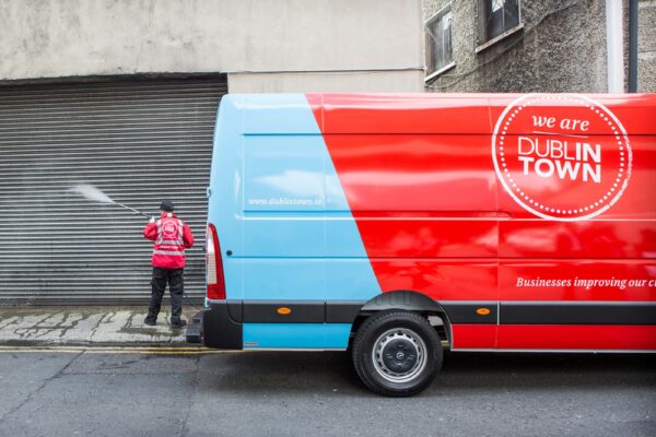
Businesses improving our city
Retail + Public & NGO
Our public employment support service
Public & NGO + Education
The stamp of quality for qualifications in Ireland
Public & NGO + Education


